
By Emily Miranker, Project Coordinator
Welcome to my celebration of one of our collections’ unsung heroes – not a specific book, or author, but a punctuation mark that decorates many of them: the manicule.

As you can see from the example above, the manicule is a disembodied, pointing hand. In case this, as in many, the manicule also has a little cuff, and a fingernail on the pointing finger that is visible, too. This manicule comes from our Anatomia Carpi by Jacopo Berengario da Carpi, a 16th century Italian physician.
The manicule gets its name from the Latin maniculum for “little hand.” This connection with the actual human body is apparent in some of the other names of the symbol: fist, printer’s first, bishop’s fist, pointer, pointing hand, even mutton-fist.[1] Its usage starts around the 12th century, though there is a record of it appearing in the Domesday Book of 1086 in John Johnson’s Typographia.[2]
Professor William Sherman of York University draws a connection between the classical gesture of “three fingers doubled under the thumb [and index the] finger extended”[3] from formal Roman oration to the strong connection between hands and texts when zeroing in on the manicule in his research on marginalia. Sherman observes the bond between hands and reading is so innate it often goes unnoticed:
“Unless we’re wrestling with an unusually large volume or feeling our way through an unusually delicate book; unless we’re running our fingertips over a text in Braille or our pointers through a Torah scroll; and unless we’re the kind of reader who follows along with our index finger or gives them a good lick before turning the page, it’s probably safe to say that we’re not even conscious of our hands as we make our way through a text.”
It’s certainly compelling to think of the manicule mark as the descendent of an oratory pose and natural human gesticulation.
Manicules are windows into people’s relationships with their books and texts. Time was taken to read the passage, react to it and record or reference it by hand on the page, which makes sense given the tremendous amount of work, time and expense it once took to get a book into your hands. Keith Houston, author of Shady Characters, observed readers’ investment and attachment to their books was quite unlike the modern day consumer. “It was second nature for a book’s owner to brand it, to annotate and embellish it as they read; to underline pithy phrases and fill the margins with notes.”[4] Indeed, the manicule isn’t really a punctuation mark, something put in by the author for grammatical structural or clarity. Rather, it’s a reader’s mark indicating something to that person – something that could be wholly mysterious, banal, or unimportant to me or you.
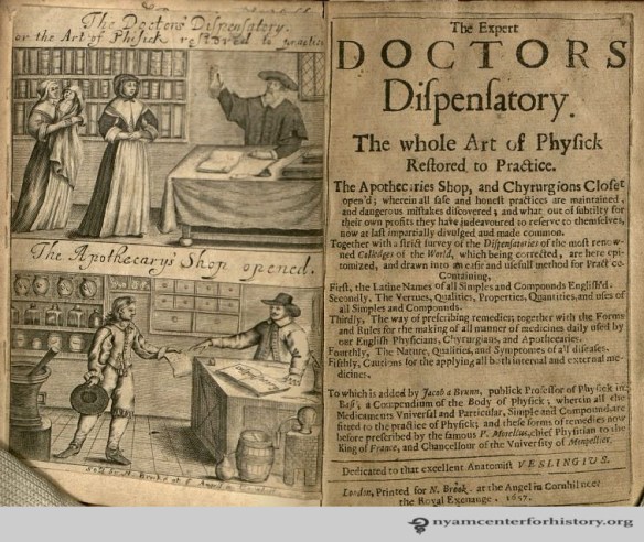
One past owner of our 1657 copy of The Doctor’s Dispensary found many points of interest in the book. Its pages are littered with marginal notes, underlining and manicules. This reader’s manicules are fairly simple, though they do include a cuff –or possibly a sleeve or an arm- while some examples can have long sleeves that drip down to mark the end of the passage of notable text, complete with shading on the clothing or secondary digits pointing things out as well.


As intellectual and cultural knowledge fairly exploded during the Renaissance, ink flowed from readers marking up their books. Then came the world-altering printing press from Johannes Gutenberg in 1440 in Mainz, Germany. Readers continued to annotate their printed books just as they had their handwritten ones; and printed manicules joined the handwritten ones on the page.[5] Printers inserted in-line manicules that indicated authorial notations that were not the readers’ own commentary, subtly (or not) guiding a reader to the ‘correct’ interpretation of the work. Printed manicules became more prominent as authors and publishers took advantage of a means to protect the integrity of their work. The manicule drawn in by hand more or less died out by the 19th century.

The mark lived on in its printed form and got almost annoyingly ubiquitous by the end of the 19th century. Manicules were a bread and butter symbol for advertising typography where they literally pointed the way to headlines, punchlines, venues and notable names.[6] They were even on gravestones, pointing the way to heaven.[7]

This gravestone photo from a Virginia cemetery was snapped by literature professor and medievalist Jonathan Hsy of George Washington University.
The public visually overdosed on the manicule as this point and it fell from such frequent (over)use. The manicule is definitely still around though; on returned envelopes from the US postal service, in design products seeking to impart a vintage flare and in directional signage. And of course in the newest frontier of information and communication; the digital screen where the computer’s cursor was, and sometimes still is, a hand pointing the way.

References
[1] Sherman, William H. Towards a History of the Manicule, 2005. Accessed November 22, 2016.
[2] McPharlin, Paul. Roman numerals, typographic leaves and pointing hands: some notes on their origin, history and contemporary use. New York: Typophiles, 1942. 47.
[3] Sherman, William H. Towards a History of the Manicule, 2005. Accessed November 22, 2016.
[4] Houston, Keith. Shady Characters: The Secret Life of Punctuation, Symbols & Other Typographic Marks. New York: W.W. Norton & Company, 2013. 170.
[5] Houston, Shady Characters. 178.
[6] Palmer & Rey. Palmer & Rey’s Type Specimen Book. San Francisco: Palmer & Rey, 1887.
[7] McPharlin, Roman numerals, 1942. 65.
