Crimson in Memory

By Emily Miranker, Events and Projects Manager

In Flanders fields the poppies blow
Between the crosses, row on row,
That mark our place; and in the sky
The larks, still bravely singing, fly
Scarce heard amid the guns below.

We are the Dead. Short days ago
We lived, felt dawn, saw sunset glow,
Loved and were loved, and now we lie
In Flanders fields.

Take up our quarrel with the foe:
To you from failing hands we throw
The torch; be yours to hold it high.
If ye break faith with us who die
We shall not sleep, though poppies grow
In Flanders fields.

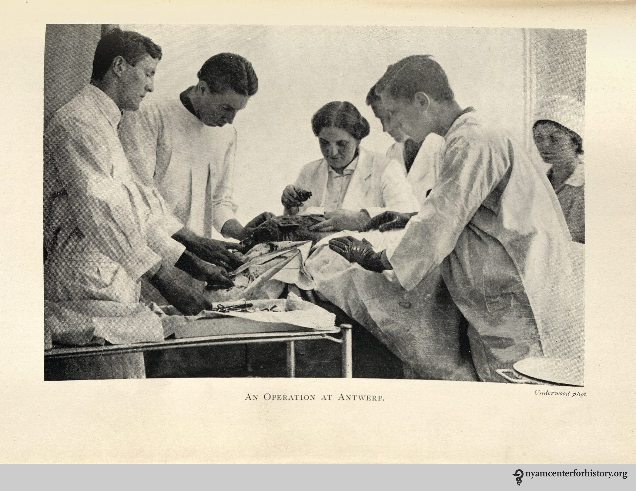
Canadian doctor John McCrae wrote this poem on a May morning in 1915 in Ypres, what had been a stunning Belgian medieval city then horribly bombarded in the ghastly slaughter of the First World War. The evening before McCrae wrote In Flanders Fields, he presided over the burial of his friend Lt. Alexis Helmer, who died by German shellfire on May 2.[1]

John_McCrae_in_uniform_circa_1914

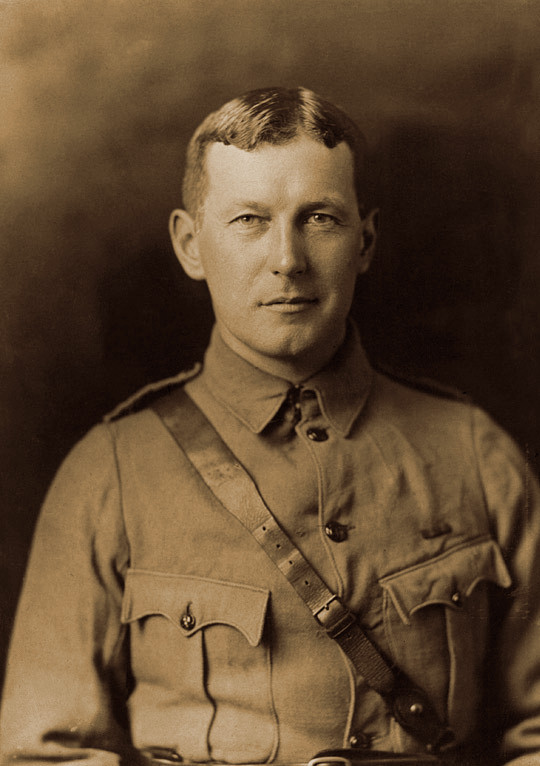
John McCrae in uniform circa 1914.  Source: William Notman and Son – Guelph Museums, Reference No. M968.354.1.2x

McCrae was one of many soldiers serving in WWI who found writing poetry an outlet for the horrors and grief, hope and homesickness of the conflict; others include Wilfred Owen, Siegfried Sassoon, Rudolf Binding, and Laurence Binyon. In Flanders Fields may be among the best known poems from the era today, in part due to the power and symbolism of the poppy flowers he evoked.

The flowers McCrae was looking at that May were Papaver rhoeas, the corn poppy beautifully shown in The British Flora Medica by Benjamin Barton. The sensation caused by the publication of McCrae’s poem got the flower rechristened the Flanders poppy.

Barton-Castle_BritishFloraMedica_1877_poppy_watermark

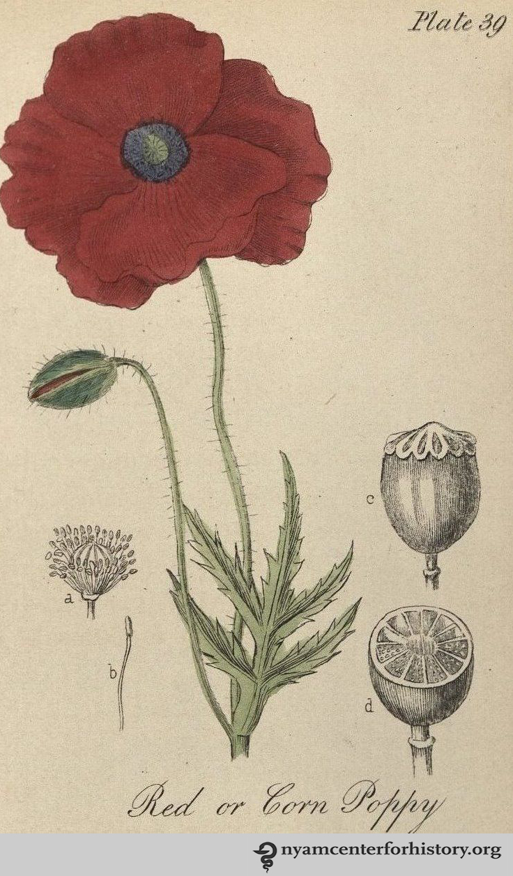
Red or corn poppy. Source: The British flora medica: a history of the medicinal plants of Great Britain by Benjamin H. Barton and Thomas Castle (1877).

In the popular mind, the corn (or Flanders) poppy is often confused or conflated with its cousin, Papaver somniferum –bringer of sleep- the opium poppy. Papaver somniferum pods contains a resin that has morphine and codeine (the only flowering plant known to contain morphine).[2] Both species spread to Europe and across Asia from the Middle East, helped along by trade routes as well as the Crusades. Since ancient times the opium poppy was used as a pain killer, making it a constant companion throughout history to the battlefield wounded, to veterans, and to civilian populations. In high enough doses, it can cause death. By contrast, the corn poppy’s milky sap contains alkaloid rhoeadine, a sedative. From ancient times to the present, the corn poppy has been used to make soporific tea, a milder respite than that offered by its cousin.

Woodville_opium poppy_1793_watermark

Opium poppy. Source: Medical Botany by William Woodville (1793).

The corn and opium poppies have had a long relationship with people and war. Indeed, the opium poppy gave its name to conflicts over British trade rights and Chinese sovereignty in the min-19th century,  called The Opium Wars.

Poppies have been on many battlefields as relief from pain, a resource to fight over, and as a vivid, little sign of hope or remembrance. The flower as an official symbol for remembrance has roots in New York City.

University of Columbia professor and humanitarian Moina Belle Michael wrote a response to McCrae’s poem, We Shall Keep the Faith, in 1918. Inspired by McCrae’s imagery, she wore a silk version in remembrance of the war’s dead, and spearheaded the American movement to have the flower officially recognized as a memorial symbol, and for money from its sale to help veterans. Across the Atlantic, another Poppy Lady, Anna Géurin, campaigned for selling flowers particularly to aid the women and orphans of France.[3]

curtis-botanical-v2-1788_plate57_EasternPoppy_watermark

Eastern poppy. Source: The Botanical Magazine, v2, plate 57 (1788).

Poppies grow most readily in churned earth, so they flourish around people who constantly disturb, till, and work soil for various reasons: to build, to garden, to bury the dead. Before the upheavals of trenches and bombardment, poppies grew in Flanders, but not to the extant described by American William Stidger working for the YMCA in French battlefields in WWI:

“a blood-red poppy…[by the millions] covering a green field like a blanket…I thought to myself: They look as if they had once been our golden California poppies, but that in these years of war every last one of them had been dipped in the blood of those brave lads who died for us, and forever after shall they be crimson in memory of these who have given so much for humanity.”[4]

A grisly fact underlay the profusion of poppies on the Western Front. The soil of Flanders had not been rich enough in lime to sustain massive numbers of poppies. The infusion the earth received from the rubble of towns and the calcium from human bones allowed the poppies to flourish in greater numbers than ever before; a fitting beacon of regeneration as well as an ever present sign of the dead and destruction.

References:
[1] David Lloyd. Battlefield Tourism: Pilgrimage and the Commemoration of the Great in Britain, Australia and Canada. Oxford: Berg; 1998.
[2] Nicholas J. Saunders. The Poppy: A History of Conflict, Loss, Remembrance & Redemption. London: One World; 2013.
[3] The Story Behind the Remembrance Poppy. The Great War 1914 – 1918. Accessed April 13, 2017.
[4] William Stidger. Soldiers Silhouettes on our Front. New York, Scribner’s Sons; 1918.

Shop Ad for poppies post

Graduations and Congratulations

By Lisa O’Sullivan, Director

Graduation season is quickly approaching, which means students in medicine, nursing, and the allied health professions will soon be celebrating their accomplishments with family and friends. To help celebrate, we have designed a new collection for our online shop featuring medical symbols.

Some of the symbols of health and medicine are relatively new historically, while others have a long and complex history.  Perhaps the most persistent symbol of medical care is the caduceus, the snakes coiled around a staff. The origins of the symbol go back to the classical world, where Asclepius, the god of medicine, was generally depicted carrying a staff with a snake coiled around it.  Asclepius’s staff was gradually replaced by the caduceus, which shows two snakes entwined around each other and a central staff.[1]

Blue Cadu chocolates

An elegant caduceus drawn by renowned obstetrics pioneer, maternal health educator, and Academy Fellow, Dr. Robert Latou Dickinson.

Asclepius’s daughter, Hygieia, was the goddess of health, cleanliness, and sanitation. Hygieia was often symbolized by a snake drinking from a bowl , and was shown in sculptures and images with a serpent entwined around her. Her chalice and bowl remain a potent symbol of pharmacy around the world.[2]

Bowl of hygieia china cup

This Hygieia mug was made using an image of the brass inlay from the lobby floor of The New York Academy of Medicine.

The stethoscope, invented by René-Théophile-Hyacinthe Laënnec in 1816, only took on the binaural form familiar today in the mid-19th century after much experimentation. The double stethoscope, which allowed the physician to listen to the sounds of the body with both ears, relied on the incorporation of flexible materials such as rubber and gutta-percha to become truly practical.[3]

Scalpel & Stetho totebag

The scalpel and stethoscope” was a late 19th century monthly magazine for “the surgical and medical professionals, and all kindred branches.”

Some version of a professional oath in which health professionals pledge to conduct themselves along strict ethical lines is a standard feature in most medical graduations. The most common and well-known of these is the Hippocratic Oath. The Oath is commonly dated to the fourth century BCE. Its original form was modified in Christian Europe in the medieval period, and has been in use in one form or another ever since, becoming particularly prevalent in the post-World War II era.[4]

Oath Notebook

 An early 20th century illustration of the Hippocratic Oath.

You can find these and other symbols on a range of products in our online shop’s Graduation Collection.  All proceeds from the Library shop support the preservation of the Library’s collections and its public programming in history, the humanities and the arts.

Shop Now

References:
[1] O’Sullivan L. Snakes in Medicine: Slippery Symbolism.  Books, Health and History. The New York Academy of Medicine, 29 Aug. 2012.
[2] History of the Bowl of Hygeia award. Drug Topics 2002;19. 
Accessed 6 Apr. 2017.
[3] Blaufox MD. An ear to the chest : an illustrated history of the evolution of the stethoscope. Boca Raton : Parthenon Pub. Group; 2002, pp41-62.
[4] Hulkower R. The history of the Hippocratic Oath: outdated, inauthentic, and yet still relevant. Einstein Journal of Biology and Medicine. 2016; 25(1):41-44

Robert L. Dickinson: Doctor and Artist

Today’s guest post is written by Rose Holz, Ph.D., historian of medicine and sexuality at the University of Nebraska – Lincoln where she serves as the Associate Director of the Women’s & Gender Studies Program and Director of Humanities in Medicine.  She is the author of The Birth Control Clinic in a Marketplace World (Rochester, 2012). Her current project investigates the intersection of medicine and art by way Dr. Robert L. Dickinson (1861-1950) — gynecologist, sexologist, and artist extraordinaire — and his prolific ten-year collaboration with fellow artist Abram Belskie (1907-1988). Not only did it yield in 1939 the hugely influential Birth Series sculptures but also hundreds of medical teaching models about women’s and men’s sexual anatomies. On Thursday, April 13, Rose will give her talk, “Art in the Service of Medical Education: The Robert L. Dickinson-Belskie Birth Series and the Use of Sculpture to Teach the Process of Human Development from Fertilization Through Delivery.” To read more about this lecture and to register, go HERE.

My interest in Dr. Robert L. Dickinson began many years ago when I was in graduate school, working on my Ph.D. in history and writing my dissertation on the history of birth control clinics in America. And, as has been the case with so many other scholars who have written about matters related to women, medicine, and sexuality in the twentieth century U.S., Dickinson made his brief cameo entrance into my story, though not without leaving behind a lasting impression.

For me it was the images — because, like me, Dickinson was compelled to color and draw. Early on, while pouring over Planned Parenthood records, I remember chuckling over a letter he had written to a contraceptive manufacturer complaining about the poor quality of one of their products, to which he then attached a drawing to illustrate his case.

Then there were the birth control manuals Dickinson wrote in the 1930s. Not only did he illustrate all the contraceptive methods then available, but he also offered birds-eye-view, architectural-style drawings to visualize how best to lay out gynecological clinics. More intriguingly still was what he included at the center of this architectural drawing, a tiny woman lying on the gynecological table with her legs spread wide open as the doctor conducted the physical exam.

IMG_4813

Pages from “Control of Contraception (2nd edition)” by Robert L. Dickinson.

As somebody who also loves small things—especially miniature worlds populated by miniature people—I could not help but find myself be smitten by this unusual man. However, at the time I had a different story to tell, a Ph.D. to defend, and a new job as a professor to pursue. And as the years passed, Dickinson slowly receded into the background.

IMG_1603

Drawings of the location of Embryo and size of Fetus. Source.

But Dickinson is not one to be denied, and that he has remained in obscurity for so long somehow explains to me why he has resurfaced—with a glorious vengeance—into my imagination. Indeed, he has made it clear to me that his story will be told; his skills as a doctor and artist properly recognized. And he has made it further clear that this story will begin with what he created in the twilight of his life: The 1939 Birth Series sculptures.

IMG_2449

Dickinson and Belskie’s “Sculptured Teaching Models Collection.” From the unprocessed Abram Belskie Papers, Belskie Museum, Closter, NJ.

Join us on Thursday, April 13 to learn more about Dr. Robert L. Dickinson and his Birth Series sculptures. To RSVP to this free lecture, click HERE.

War Wounded

Paul Theerman, Associate Director

On April 6, 1917, the United States entered the Great War on the side of the Allied powers. By the following fall, those powers were victorious, in part due to the American presence, adding industrial might and men to the stalled conflict and making up for the Russian withdrawal after the October Revolution.

Combat is the most vivid part of war. Victory often depends, however, on maintaining the military effort, and this meant mobilization, training, logistics, supply, and above all, the “medical front.” Armies had to take the wounded soldier, help him heal, and return him to battle. For World War I, that front was where men’s wounds met the medical machine.

Dupuy-Stretcher Bearer-Fig 134_watermark

From a training book for stretcher bearers. Image source.

How were men wounded in the war? The strain and the boredom of trench warfare are part of our collective memory; the drama of that war comes from two sources: mustard gas and machine guns. The use of chemical weapons and the mechanization of shooting brought horror to men’s lives at the front. Yet they were not the greatest source of casualties. By far, artillery was the biggest killer in World War I, and provided the greatest source of war wounded.

In his book Trench: A History of Trench Warfare on the Western Front (2010), Stephen Bull concluded that in the western front, artillery was the biggest killer, responsible for “two-thirds of all deaths and injuries on the Western Front.”[1] Of this total, perhaps a third resulted in death, two-thirds in injuries. Artillery wounded the whole body. If not entirely obliterated, the body was often dismembered, losing arms, legs, ears, noses, and even faces. Even when there was not superficial damage, concussive injuries and “shell shock” put many men out of action. Of course, shooting—in combat as well as from snipers—was another great source of wounding. Gas attacks were a third. Phosgene, chlorine, mustard gas, and tear gas debilitated more than killed, though many ended up suffering long-term disability. Overall the war claimed about 10 million military dead, and about 20–21 million military wounded, with perhaps 5% of those wounds life-debilitating, that is, about a million persons.[2]

Church-Doctors Part_p168_watermark

Moving the wounded. Image source.

Outcomes depended on getting treatment quickly. Evacuation and triage became watchwords of the war-wounded. For the British Army, for example, the Royal Army Medical Corps developed an extensive system to move the wounded from the front to the rear, with triage at each step. Stretcher bearers evacuated the wounded to Regimental Aid Posts (RAP)—or at least those that they had the means to move, for when stretcher-bearers were few, the worst cases were left on the field of battle.

Church-Doctors Part_p54_watermark

The path from the front to the hospital. Image source.

In one report of a man severely wounded in the abdomen, “Since ‘death awaited him with certainty . . . I gave him a hypodermic of morphia and we propped him up as comfortably as we could’ and left him there.”[3] Behind the RAPs were Advanced Dressing Stations, then further back Main Dressing Stations, and finally, Casualty Clearing Stations. Each move to the rear—always challenging in itself—was based on an assessment of the injury and the chances of survival. The lightly wounded—those likely to recover quickly—and the “moribund”—those likely to die—were kept, and the others sent on. Each station provided stabilization and immediate care, with some basic surgeries, such as amputation, at Casualty Clearing Stations. More advanced treatment occurred at hospitals, either back in Britain or in France. As the war wore on, more of the wounded were kept in France, at hospitals far back from the lines. This was to use less transport and to maintain military morale, with the goal of returning the men to the front as quickly as possible. And indeed, American medical entry into the war came first in the form of hospitals. “The first six [mobile hospitals] to arrive in France took over British General Hospitals and provided hospital level care for the British. Other American hospitals arriving later in the summer of 1917, remained assigned to the American forces.”[4] The Allied pattern of medical triage and evacuation became the model for American efforts.

Church-Doctors Part_p84_watermark2

The fracture ward; the term “machine shop” likely refers to the frames and power belts that characterized such shops at the turn of the last century. Image source.

How well did the system work? “War is a matter of expedients.”[5] The medical operation was persistently understaffed and under-resourced. In the latter part of the war, as the static front changed to a dynamic one, some medical units had difficulty achieving the mobility needed. And inevitably, given the need continually to evaluate the severity of wounds, and the difficulty of transport, some men ended up in the wrong place, some facilities were too crowded, and others were underused. Finally, in 1918 the medical system began to be overrun with influenza cases. Overall, though, the magnitude of the challenge needs to be kept in mind. In just the American experience, for an army that numbered almost 2 million men in France at the end of the war, 1.2 million men passed through the medical system, with about quarter million military wounded.[6] That is an astounding number for which to provide medical services under severe stress.

Souttar_Surgeon in Belgium-p22_watermark

Surgery in a Belgian field hospital. Image source.

References:
[1]“Krilling for Company.” Mud Feud [Review of Trench: A History of Trench Warfare on the Western Front, by Stephen Bull (Osprey Publishing 2010)]. Papyrocentric Performativity. Published July 14, 2014. Accessed March 21, 2017.
[2] The total number of killed from the Allied Powers exceeded that of the Central Powers by over a million; the total wounded exceeded by perhaps 4 million. Accurate statistics are hard come by; these are based on Antoine Prost. War losses. 1914-1918-online: International encyclopedia of the First World War. Published August 10, 2014. Accessed March 21, 2017.
[3] Carden-Coyne A. The Politics of wounds: Military patients and medical power in the First World War. Oxford: Oxford University Press; 2014. P. 65.
[4] Jaffin J. Medical support for the American Expeditionary Forces in France during the First World War. Published 1990. Accessed March 31, 2017. Pp. 95–96.
[5] Helmuth Karl Bernhard Graf von Moltke. Wikiquote. Published October 7, 2006. Updated September 1, 2016. Accessed March 31, 2017.
[6] Jaffin J. P. 166.

Annette Smith Burgess: Ophthalmological Illustrator

By Arlene Shaner, Historical Collections Librarian

An earlier blog post of ours highlighted the work of Gladys McHugh, a medical illustrator who used transparent acetate sheets to create her illustrations for The Human Eye in Anatomical Transparencies and The Human Ear in Anatomical Transparencies.  McHugh studied medical illustration with Max Brödel at Johns Hopkins in the Department of Art as Applied to Medicine, one of a significant number of women who trained with him to become well-known medical illustrators.

Annette Smith Burgess (1899-1962), was another of Brödel’s students.  Burgess studied with Brödel for three years starting in 1923 before becoming the first ophthalmic illustrator for the Wilmer Eye Institute, a position she held for the next 35 years, until her retirement in 1961.  Beginning in 1946 (and more officially in 1948), she took on an additional role as an instructor in the Art as Applied to Medicine program.

Burgess portrait_watermark

Portrait of Annette Smith Burgess.[1]

In 1934, William Holland Wilmer published his Atlas Fundus Oculi, illustrated with one hundred color plates, all of which were reproduced from paintings made by Burgess.  These lushly colored lithographs took quite a bit of work to make.  As Wilmer states in his foreword to the atlas, “The accurate printing of fundus drawings in colour is a very laborious and costly undertaking; sometimes in offset-lithography from eight to sixteen impressions (one mat for every colour) are required to produce one plate.  The cheaper processes are far from satisfactory…”[2]

Burgess Pl. 30 Wilmer_watermark

“Papillo-retinitis, with Papilledema, Toxic and Mechanical” (plate 30), from Atlas Fundus Oculi (1934).

Burgess was more than qualified to take on this challenge.  To make her paintings, she became a skilled user of the ophthalmoscope and the slit lamp.  Writing about the process by which she created her illustrations, Dr Alan C. Woods explained that to show the ocular lesions related to a particular disease “she would make six drawings from different eyes depicting the various lesions and gradations thereof, rather than paint and sign her name to any drawing which was not a faithful portrayal of the lesions actually present in the eye under study.”[3]  This meticulous work increased the value of the illustrations for users of the atlas, as their level of accuracy was extraordinary, rendering the experience of looking at the illustrations very close to that of looking through an ophthalmoscope itself.  Some of Wilmer’s descriptions also include detailed half-tone illustrations of particular features he wanted to highlight; these, too, were drawn by Burgess.

Burgess Pl. 34 Wilmer_watermark

“Choroiditis, Diffuse, with Ascending Perineuritis” (plate 34) from Atlas Fundus Oculi (1934).

Burgess Pl. 34 halftones Wilmer_watermark

“Choroiditis, Diffuse, with Ascending Perineuritis” (plate 34) halftones from Atlas Fundus Oculi (1934).

Burgess also collaborated with Woods, providing the illustrations for Endogenous Uveitis (1956) and Endogenous Inflammations of the Uveal Tract (1961), although in both of those volumes her paintings were reproduced using photographic processes rather than lithography, and reduced in size.  While still extraordinarily beautiful, the texture found in the earlier lithographs disappears in the reproductions in these later publications.

Plates XXVII and XXVIII (left) and plates XXIX and XXX (right), from Endogenous Uveitis (1956).[4]

For decades after her death, the Department of Art as Applied to Medicine at Hopkins continued to celebrate Annette Burgess’s legacy with an award to honor excellence in ophthalmological illustration.

References:
[1] Davis RW. Annette Smith Burgess (1899-1962).  Journal of the Association of Medical Illustrators. 1963; 14:25-28.
[2] Wilmer WH. Atlas Fundus Oculi. New York: MacMillan; 1934, p. 7.
[3] Woods AC.  Obituary in “News and Comment.” Archives of Ophthalmology. 1962; 68(6): 880.
[4] Woods AC. Endogenous Uveitis. Baltimore: Wiliams & Wilkins, 1956.

The “Best” Tonic: Pabst Malt Extract Pamphlets in the Academy Library

By Anne Garner, Curator, Rare Books and Manuscripts

INTROpabstmaltextract_stand-upad_nd_watermark

Girl in yellow embracing a Pabst Malt Extract bottle. Click to Enlarge.

Guinness enthusiasts are well familiar with the brewery’s famous tagline “Guinness Is Good for You.”  But did you know that the American company Pabst staged a successful marketing campaign in the late nineteenth and early twentieth centuries built on the idea that their own Milwaukee-based malt extract could cure a range of ailments?  A series of pamphlets produced by the Pabst Brewing Company tells the story.

Pabst has its origins in Milwaukee, Wisconsin, a city well-situated for a brewery with its harbor, its caves (nature’s coolers, before refrigeration), and its large population of German immigrants.[1]

An 1897 edition of Henriette Davidis’ Praktisches Kochbuch, published in Milwaukee in both German and English for an audience of German-Americans, includes some fourteen recipes using the beverage, including beer soup, beer with raisins, and beer eggs.

Pabst was first established as the Empire Brewery in Milwaukee in 1844 by German immigrant Jacob Best.  In 1872, Frederick Pabst, married to Best’s granddaughter, became president of the company.  It was renamed after Pabst in 1889.

Henriette Davidis’ Praktisches Kochbuch (1897). Click to Enlarge.

Milwaukee from “Wedding Secrets,” Page 33. Click to Enlarge.

Beginning in 1876, Pabst won awards for its formula.  The company began to tie blue ribbons around the necks of their bottles to mark its first place status. The name stuck, and was later incorporated into their brand in 1895).[2]

By the 1890’s, many American breweries were manufacturing malt extract for medicinal purposes.  This thick, syrupy liquid derived from barley and grains certainly contained sugar and may have contained some nutrients.  Malt Extracts were widely used as a digestive aid, and for the recovery of convalescents.

Convalescent double-page spread from “Heart Darts” (ca.1908). Click to Enlarge.

But they also contained alcohol.  In 1896 at a meeting of the Boston Society of Medical Sciences, Dr. Charles Harrington shared his findings after a study of the ingredients of these preparations:

“Twenty-one different brands of liquid malt extract were obtained and analyzed. That they were not true malt extracts is shown by the fact that in no one was there the slightest diastatic power; all were alcoholic, some being stronger than beer, ale, or even porter. In a number of specimens a large amount of salicylic acid was detected.”[3]

Pabst promotes their Malt extract in a series of pamphlets in our collection.  In the earliest of those here at the library, “More Secrets,” (1889), the text asserts that their tonic is:

“a simple extract of Malt and Hops, precisely similar in nutrition and medicinal value to those hitherto so extensively prescribed by the entire medical profession.  It is not a patent medicine.”

Two years earlier, a paper given by author and researcher S.P. Sharples, showed that Pabst’s malt extract contained 5.16 cubic centimeters of alcohol in a 100 cubic centimeters of the liquid.[4]  Like many patent medicines, a full list of the formula’s ingredients is not given in the advertising material.

The pamphlets also suggest use for ailments similar to those treated by patent medicines.  A pamphlet called “Heart Darts” (ca. 1908) recommends Pabst Extract for the overworked, the nervous, the dyspepsic and the old aged, and includes charming illustrations of the afflicted:

Dyspepsia, insomnia, nervousness and overworked, all from “Health Darts” (1908).

Pabst also claimed to cure insomnia.  “100 Points of Perfection” (ca. 1894) argues against taking drugs for sleep, but recognizes the necessity of sleep to produce calm nerves. How to sleep?  According to “100 Points,” choose Pabst, and “Take a bottle a day, for two weeks.”  Zzzzzzzzzzzzzzzzzzzz.

Ghosts and sleep from “100 Points of Perfection” (ca. 1894). Click to Enlarge.

During the 1890’s, Pabst ran a series of ads in women’s medical journals to target nursing mothers.

Ad from Women’s Medical Journal (1895). Click to Enlarge.

As their pamphlet “Baby Secrets” explains, the extract is “an ideal preparation for nursing mothers, giving them abundant nourishment to resist the extra drain upon the system” and aids in sleep. Harried mothers are also promised that a bottle a day for 24 days will restore beauty.

The back cover of “Baby Secrets” (1897) features a conspiring Cupid whispering into a stork’s ear. Click to Enlarge.

“Baby Secrets” is one in a series of “Secrets” pamphlets produced in the 1890’s, available by mail order for free.  The Academy Library has eight in total. Click on images to enlarge.

“More Secrets” (ca. 1889) opens with the assertion that Pabst malt liquor is not a patent medicine, but “a simple extract of Malt and Hops, precisely similar in nutrition and medicinal value to those hitherto so extensively prescribed by the entire medical profession.”

“Still More Secrets” (1890) offers guidance for nursing mothers: Do nurse him, do help him,/ Throw bottles away;/ You take the “Best” Tonic,” / He’ll come here to stay.”

“Untold Secrets” (ca. 1892) emphasizes the importance of sleep.

“Ominous Secrets” (1894) which contains stories of mysteries and omens, journeys and old world luxuries, shows an old man kneeling in front of the Sphinx.

“Wedding Secrets” (1895) features a sheepish Cupid, next to the discarded flowers and shoes belonging to the bride and groom.

“Home Secrets” (1898) features a smiling woman with her head resting languidly on her hand, waving an empty teacup.

“Open Secrets,” (ca. 1895) recommends Pabst malt extract as a meal and as a remedy to young mothers, whose children have “almost drained their young lives away.” It closes with a plug for their beer– “we will see that you get [it] without difficulty.”

Malt Tonic from “100 Points” back cover (ca. 1894).

When Prohibition went into effect in 1920, Pabst had the manufacture of malt extract to fall back on (as well as another Wisconsin no-brainer of a product: cheese).  That same year, Pabst began to market it for its cooking properties, as a sugar substitute and to leaven bread.  But it really came in handy for bootleg home-brews.  The newspaper of Lima, Ohio reported in 1929 that the weekly sales of malt there could produce the equivalent of 400,000 pints of beer.[5] 

McGuiness menu cover and beer list.

When the Volstead Act was repealed, Pabst reprises their production of their Blue Ribbon brand with a vengeance.  This New York menu, probably from the 1940’s from the midtown New York Irish bar McGinnis shows a range of beers available, including both Guinness and Pabst.  We’re wondering if the 5 cents price difference implies that while Guinness might be good for you, Pabst was banking on an audience that thought it might be even better.

References:
[1] Smith, Gregg.  Beer in America:  The Early Years – 1587-1840.  Boulder:  Brewer’s Publications, 1998.
[2] From “The Whole Story.”  Accessed March 2, 2017 at http://pabstblueribbon.com/pbr-history/.
[3] See Martha Meir Allen’s Alcohol:  A Dangerous and Unnecessary Medicine.  Marcellus, N.Y. : National Woman’s Christian Temperance Union, c1900. P. 316.
[4] Allen, p. 317.
[5] Lima News, March 31, 1929.

“Feminist Futures” Class Review

By Audrey Sage Lorberfeld, Digital Technical Specialist

For three hours each Monday evening, January 30 through February 20, the Academy hosted a Brooklyn Institute for Social Research class called Feminist Futures, for which I was lucky enough to be the staff liaison. My classmates ran the gamut from PhD students to artists to professors to web developers to librarians and archivists. Our professor, Danya Glabau, guided us through the intellectual history of the intersection of science studies and feminist theory. Professor Glabau’s syllabus included the writings of such luminaries as Donna Haraway, Bruno Latour, Evelyn Fox Keller, and Emily Martin. To complement these readings, the Academy was able to provide some of its own treasures as well.

One such item was the Traité d’osteologié, published in 1759 with text by the Scottish anatomist Alexander Monro and illustrations supervised by Marie Geneviève Charlotte Thiroux D’Arconville.  D’Arconville studied anatomy at the Jardin Du Roi and translated Monro’s earlier text into French for this volume. Although her name does not appear anywhere in the text (her plates were published under the protection of Jean-Jacques Sue, a member of the French Royal Academy), it is generally accepted that d’Arconville is the hand behind the gorgeous images. Among her plates are incredible depictions of male and female skeletons that display features associated with each gender. She renders the male skeleton as large and statuesque and places him in front of a backdrop of Classical architecture. Her female skeleton, on the other hand, is more petite and stands in a less assertive position. Noticeably, her rib cage is extremely narrow while her wide hips and pelvis are very emphasized. There is speculation that the image of a narrow rib cage is meant to associate the skeleton with upper class women who usually wore corsets.

monro-sue_traitedosteologie_1759_watermark

Female skeleton from Traité d’osteologié (1759)

Paired with this item for a unit titled “Feminist Objectivity” were Donna Haraway’s “Situated Knowledges: The Science Question in Feminism and the Privilege of Partial Perspective,” Karen Barad’s “Meeting the Universe Halfway: Realism and Social Constructivism Without Contradiction,” and Michelle Murphy’s “Immodest Witnessing: The Epistemology of Vaginal Self-Examination in the U.S. Feminist Self-Help Movement.” Among other topics, we guessed at what our authors might have thought of today’s quantified-self movement and whether or not data about the self could be categorized as an extension of that self. Further, we asked: what happens to this paradigm when you engage with its exponential commodification? Could self-awareness excuse the self from the ‘wrong type’ of objectification? We also spent a significant part of the class analyzing what Haraway’s idea of “seeing from below” might mean in our current political climate.[1] We queried, is it possible to adopt Haraway’s type of situated knowledge and avoid being ableist?

ffimage_edited

“Feminist Futures” class taking place at the Academy.Image source: Suzanne Schneider, Director of Operations and Core Faculty at Brooklyn Institute for Social Research.

One of my favorite quotes from this part of the course was “rational knowledge does not pretend to disengagement.”[2] I took this to mean that pushing for a type of feminist objectivity that highlights seeing from below and/or something Barad calls “agential realism” does not mean that you are disengaging from your subject.[3] Rather, it means that you are striving towards a feminist typology of embodiment that focuses its recuperative energies on welcoming emotions and relationships as data, all the while keeping in mind that “no knowledge is innocent.”[4] This was a very powerful idea to me as a woman working at the Academy in a nexus of technology, history, and public service.

We rounded out the class with a viewing of Crania America, a book published in 1889 by Samuel George Morton, a famed phrenologist. Included in his tome are illustrations of different race’s skulls along with commentary on their corresponding mental abilities. He describes his project as demonstrating that  “a particular size and form of brain is the invariable concomitant of particular dispositions and talents, and that this fact holds good in the case of nations as well as of individuals.”[5] He goes onto say that:

A knowledge of the size of the brain, and the proportions of its different parts, in the different varieties of the human race, will be the key to a correct appreciation of the differences in their natural mental endowments, on which external circumstances act only as modifying influences….[5]

As you can imagine, this item generated a passionate conversation. Highlights included discovering that the roots of cybernetics (a field which began in WWII) come from the ancient Greek adjective κυβερνητικός, meaning ‘good at steering’ (n.b. the militaristic and authoritative implications); the theory behind Chela Sandoval’s term “US third-world feminist”; and the layered irony within our assigned texts regarding authority and boundaries.

morton_crania-americana_1889_watermark

Skull from Crania America (1889)

While this course was challenging, we made sure to keep the conversation approachable and friendly. This litmus test of a Brooklyn Institute for Social Research-The New York Academy of Medicine Library collaboration solidified our belief that:

Together [our two institutions] can make the histories, presents, and futures of science and technology relevant to the lives of work adults, supporting the development of knowledge and interest in these crucial aspects of our complex and ever-changing society. (Professor Glabau)

We hope you join us next time!

References:

[1] Haraway D. Situated Knowledges: The Science Question in Feminism and the Privilege of Partial Perspective. Feminist Studies. 1988; 14(3): 575-599. (Quote on p.583).
[2] Haraway D. Simians, cyborgs, and women: the reinvention of nature. New York: Routledge;1991. (Quote on p. 196).
[3] Barad K. Meeting the Universe Halfway: Realism and Social Constructivism without Contradiction. Feminism, Science, and the Philosophy of Science. 1996;256: 161-194. (Quote on p.179).
[4] Warren K, Cheney J. Ecological Feminism and Ecosystem Ecology. Hypatia. 1991;6(1): 179-197. (Quote on p. 191).
[5] Morton S. Crania americana. Philadelphia: London, J. Dobson; Simpkin, Marshall & Co;1839. (Quote on p. 274).

Charles Bell: Artistry and Anatomy

By Anne Garner, Curator, Rare Books and Manuscripts

1bell_engravingsofthearteries_1801-plate1-crop_watermark

Close-up of plate 1 showing the heart, from Charles Bell’s Engravings of the Arteries, 1801.

Imagine you’re a medical student, and inside your go-to study text is this astonishing, hand-colored image of the heart (above). Twenty-first century medical students should be so lucky!

Engravings of the Arteries by the Scottish anatomist, Charles Bell (1774-1842), was first published in 1801, some 57 years before the first edition of Henry Gray’s Anatomy. Devised for medical students, it aimed to offer accurate and simply-rendered illustrations of the arteries to “present to the student at one glance the general distribution of the vessels and to fix them in his memory.”  The book was used by students as a preparatory text for surgical study and practice.

The ten beautifully-rendered engravings in this volume were delicately colored by hand, and labelled with letters corresponding to explanatory descriptions of the arteries on the opposite page.  In the preface to this work, Bell is explicit in his instructions on how the book was to be used:

In studying the arteries, or any part of anatomy, we should, in the first place, run the eye over the corresponding plate, then read the general description in the text; and lastly, proceed to study more closely, step by step.

For Bell, true anatomical understanding was aided in pairing accurate drawing with thorough description.  Bell also believed that a variety of bodies should be used as subjects, and that the artist must choose the most typical anatomical examples to copy accurately. Any deviation from usual forms would be preserved in the illustration, but noted and explained in the description.

3bell_engravingsofthearteries_1801_3_watermark

Plate 3, showing the carotid artery, the lower thyroid artery and the upper thyroid artery in Charles Bell’s Engravings of the Arteries, 1801.

Engravings of the Arteries was the second volume of two; Charles’ brother, John Bell, an eminent surgeon, had written the first volume of this companion set, Engravings, Explaining the Anatomy of the Bones, Muscles, and Joints, in 1794. The elder brother mentored the younger in medicine, though Charles’s formal training occurred at Edinburgh University (he earned his medical degree there in 1798.)  Both Charles and John taught anatomy at the Royal College of Surgeons, until 1804, when the brothers were banned from practicing medicine in Edinburgh by the faculty there, jealous of the success of their anatomy classes.  They moved to London that year and established a new anatomy school, as well as a thriving surgical practice.

On the left: Plate 6, showing the arteries of the arm, and on the right, plate 9, showing the arteries of the lower extremity, both from Charles Bell’s Engravings of the Arteries, 1801.

Trained as an artist, Charles Bell’s skill in this respect is a landmark of his considerable body of anatomical work.  In 1806, Bell wrote an important book, Essays on the Anatomy of Expression in Painting, combining his interest in art and medicine in a book rich in information.  This new book, for an audience of visual artists, advanced ideas he’d first voiced in Engravings, arguing for great attention to anatomy to render the human body accurately (this time, for art’s sake.)

6bell_anatomyofexpression_1806_36_watermark

Bell argued in Essays on the Anatomy of Expression in Painting (1806) that the ancient models often imitated by painters did not accurately reflect anatomical realities.

During his career, Bell also made important inroads in determining the sensory functions of the nervous system.  He was an early advocate of the idea that different parts of the brain controlled different functions; his pioneering work on the brain and cranial nerves influenced the work of other important brain researchers for decades[1].  Bell’s palsy, or facial paralysis caused by nerve dysfunction, is named after him.

For art lovers–and heart lovers too, on our minds this National Heart Month of February–Bell’s gossamer drawings have a special place in the history of anatomical illustration.  Bell understood that image and text could work in concert to save laborious use of words to convey anatomy.  But he also understood the added value of drawing the body with attention, skill, and reverence.  Bell knew that accurate and clear drawings could dramatize with nuance the systems of the body, in all their astonishing perfection. That idea is very much on display in this beautiful book.

Reference:

[1] Bell C. On the nerves; giving an account of some experiments on their structure and functions, which lead to a new arrangement of the system. Philosophical Transactions of the Royal Society of London. 1821 Jan 1;111:398-424.

ad_bell_heartcompact

Celebrate Valentine’s Day with 19th-century Medical Trade Cards

By Becky Filner, Head of Cataloging

During the last two decades of the 19th century, the United States witnessed an explosion of mass-market advertising in the form of trade cards. A combination of factors contributed. Lithography, first invented in the late 1700s, made it practical to print large runs of images relatively inexpensively. Heavy paper became less expensive because it was being made from bleached wood pulp instead of cloth. The invention of the camera supplied endless images for reproduction. Advances in high-speed steam presses made it practical to mass produce trade cards, and new modes of transportation made it possible to distribute them throughout the country.[1]

ponds_bitters-jpg_watermark

This medical trade card for Pond’s Bitters (“cures constipation, headache, indigestion, biliousness, malaria, dyspepsia”) encourages the couple depicted to focus on each other and “let the dog have the lunch!”[2]

The cards pictured here are all from an extraordinary new collection. Late last year, the Academy library received The Bingham Patent Medicine Collection as a bequest. This rich collection – a complement to our William Helfand Collection of trade cards – contains approximately 4,900 trade cards produced by pharmaceutical manufacturers in the 19th century.

These cards advertising “El Tricofero de Barry” and “Pildoritas de Reuter” were printed in New York by Barclay & Co., but the text is in Spanish. Click to enlarge.

The late Walker Bingham was a completist, and his carefully assembled collection reflects years of assiduous collecting and research. An announcement will be made when the collection is available to the public. Meanwhile, have a look at Bingham’s book, The Snake-Oil Syndrome: Patent Medicine Advertising, for more of his cards and an excellent overview of pharmaceutical advertising. Here he writes of patent medicine:

It is probable that most of the nineteenth century patent medicines had no effect at all on the diseases that they were sold to cure. They were not even palliatives. Some sufferers may have been misled into taking patent medicines instead of more effective (and possibly more expensive) drugs prescribed by a doctor, but generally speaking, at that stage of medical learning there was often little that any doctor could do for a patient with a serious disease except give emotional support.[3]

The medicines that did have more than a placebo effect often relied on ingredients like morphine, cocaine, heroin, opium, chloroform, and alcohol. These drugs were especially dangerous when given to children or self-administered in large doses. The patent medicine business was booming in the late 19th century, and it relied heavily on advertising to attract customers since the medicines were ineffectual at best. In addition to trade cards, patent medicine companies produced millions of newspaper ads, almanacs, show cards, and other mailing pieces.

Most trade cards were designed to appeal to women and children, with sentimental images of animals, flowers, babies, families, and scenery.[4] The Valentine’s Day images below fall into this category, with roses, doves, and cherubs promoting Brown’s Iron Bitters (“Cures Malaria, Dyspepsia, Weakness, &c.”), Burdock Blood Bitters (“It makes pure, healthy blood, and regulates all the organs to a proper action, cures constipation, liver and kidney complaint, female weakness, nervous and general debility, and all the distressing miseries from which two-thirds of the women in American are suffering”), Boschee’s German Syrup (“No person suffering with consumption, coughs, colds, croup, bronchitis, asthma, or any disease of the throat, lungs or chest can take it without getting immediate relief”), and Wilson’s Popular Corn Salve (we are not told what this product does, but “every box [is] guaranteed or money refunded.”)

Most trade cards were designed to appeal to women and children, with sentimental images of animals, flowers, babies, families, and scenery. Click to enlarge.

Sentimental images of couples also sell products, including a trio of kissing couples selling Smith’s Bile Beans (they “cure biliousness”), two different images of couples with umbrellas, one selling Dr. P.O. Baldo’s Blood and Liver Pills and the other selling Wilbor’s Compound of Cod Liver Oil and Phosphates, and a trade card that recommends buying a bottle of Race’s Indian Blood Renovator for your new wife “to prove to her [your] fervent love.”

Sentimental images of couples also sell products. Click to enlarge.

Other more satiric and risqué trade cards are clearly aimed at an adult audience. The card below, “The Five Senses,” is one of the racier examples in the Library’s trade card collection. The back advertises Lash’s Kidney & Liver Bitters, described as “a mild cathartic and sure cure for constipation, indigestion, biliousness, dyspepsia, malaria, chills and fever, nervous or sick headache.” The front of the card shows a series of five images of a woman “seeing” a man, “hearing” him approaching, “smelling” a flower he has given her, and sitting in his lap while he is “feeling” her bottom. The final image, “Tasting,” shows the edge of a bed and the woman’s dress, undergarments, and stockings thrown across a chair. Apparently taking Lash’s Kidney & Liver Bitters will ensure a happy Valentine’s Day!

five_senses-jpg_watermark

“The Five Senses” (above) is one of the racier examples in the Library’s trade card collection.

References:

[1] Summarized from A. Walker Bingham’s account of trade cards in The Snake-Oil Syndrome: Patent Medicine Advertising (Hanover, Massachusetts: The Christopher Publishing House, 1994), p. 117-119.
[2] All trade cards in this post are from The Bingham Patent Medicine Collection in the Library of the New York Academy of Medicine.
[3] Bingham, p. 7.
[4] According to Bingham, mothers used to paste trade cards into albums as birthday or Christmas presents for their children (p. 117.)

#ColorOurCollections: Day 5

fb-cover_828x315_nyam


Thank you to all the
institutions that took part in  #ColorOurCollections, and to all the talented artists who colored! We loved seeing your work, and some of our favorites are shared below.

We’re still tallying up participants, but so far 100 institutions have registered on ColorOurCollections.org and contributed to the collection of coloring books located there. Many more participated on social media. Institutions, it’s not too late to register and add your coloring book! The registration page will remain open until next Friday, February 17th at 5PM.

Many of this year’s coloring books featured art, plants, and animals (you can’t go wrong!), but we also saw a few other themes emerge. We saw women’s history in the coloring books of the Brooklyn Public Library, the New York State Library, Frances Willard Memorial Library and Archives, University of Houston Special Collections, and our own coloring sheet. Architecture and buildings were highlighted in Numelyo, Macalester College, DeWitt Wallace Library, Gore Place, the Watson Library at the Metropolitan Museum of Art, and many others. University archives joined in full force this year with participants such as New Mexico State University Library Archives & Special Collections, Loyola University New Orleans Special Collections & Archives, Hunter College Archives & Special Collections, and University of Manitoba Archives & Special Collections

#ColorOurCollections will return February 5-9, 2018! Until then, ColorOurCollections.org is there for all your coloring needs!

twitter11

Coloring book: Wangensteen Historical Library of Biology and Medicine, University of Minnesota Libraries

twitter19

Coloring book: University of Reading Museums and Collections Coloring Book

twitter23

Coloring book: University of Missouri Libraries, Special Collections and Rare Books

twitter22

Coloring book: Cambridge University Library

twitter34

Coloring book: Smithsonian Libraries

Check out even more beautiful colored pages in the below slideshow.

This slideshow requires JavaScript.